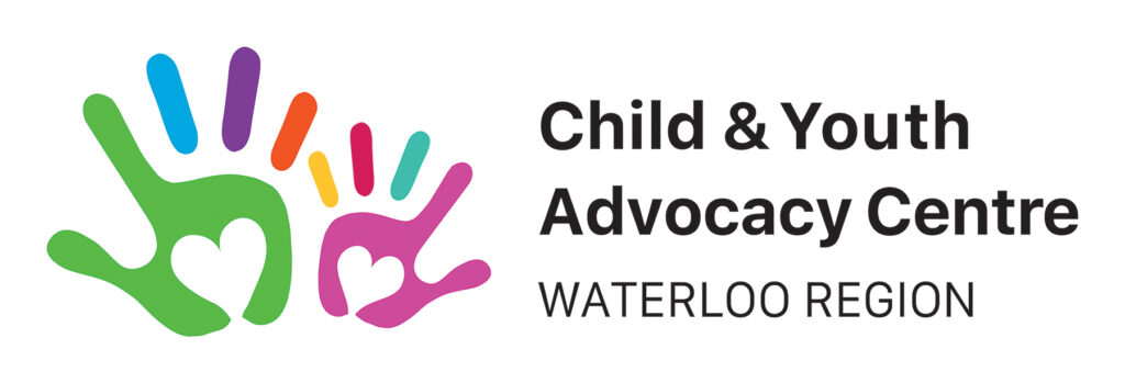
As significant demand for services continues at the Child & Youth Advocacy Centre (CYAC), we are excited to launch a new logo that aligns with this strong and progressive collaborative!
Since opening its doors in 2016, the CYAC has provided wraparound support under one roof in relation to over 3,000 investigations involving over 5,000 local children and youth. This past year, there were 632 investigations handled involving 1,006 young people as possible victims or witnesses of crime. This was the most in one year by far.
The new CYAC logo is part of raising greater awareness and support of what takes place at 400 Queen Street South, Kitchener. It embodies a warm, friendly, and welcoming place where children, youth, and caregivers can find help when facing difficulties.
The logo’s elements and characteristics convey a significant amount of meaning.
Two hands: Children and youth, and their caregivers, are not alone on their journey at the CYAC. It is a safe landing place where wraparound support is provided under one roof. Each hand can be identified as a caregiver, youth, child, team member, or support person.
Hearts: These communicate care, kindness, and compassion. The CYAC multidisciplinary team ensure a child, youth, and family-centred approach to the criminal investigation process that is trauma-informed and culturally responsive. The environment is hopeful and encouraging.
Fingers: Each finger can be interpreted as an individual receiving support or as a partner at/of the CYAC. Their coming together at the base is a reminder how together a helping hand is offered. Our services are interdependent and there is strength in our partnership and solidarity.
Colours: The variety of colours speaks to the diversity of individuals who receive support, the staff, and everyone who walks in the doors at the CYAC. It is an equitable and inclusive environment where everyone should feel welcome and accepted.
Overall design: The imagery and use of child-friendly bright colours stimulates a youthful and optimistic mood. Its modern look speaks to our collaborative being forward thinking and relevant in providing quality support to our community.
